E-commerce is a hot topic in coworking right now. But is your website working as hard as it could be?
Your website is your chance to take the on-screen lurker and transform them into a committed member. How effective you are doing this will depend on how easy your site is to navigate, how well it’s designed, your user experience, and so much more.
In this Coworking Quick Tip, we’re sharing with you five ways to create a high-converting website for your coworking space. Whether you’re building your site from scratch or just looking for a few easy optimizations, this is the article for you.
1. Nail your messaging
What is more important to your website—copy or design?
According to research by Unbounce, copy is 2x more likely to impact the conversion rate of your website compared to design. This doesn’t mean that design doesn’t matter, it just means that copy matters a bit more.
If you want a website that converts, spend some time nailing your messaging. Think about who you’re talking to, what you want to say, and what makes you different. If you haven’t spent some time outlining your ideal client or ICP, this would be the time to do so.
Messaging Exercise
Choose three members you love having in your community. Write down:
- What they do
- Why they chose your space
- What they love about it
- What they didn’t like about other options
Look for patterns amongst these people. What do they have in common? What problems were they solving with coworking? What words did they use to describe the community?
From here, write your 1-liner to serve as the foundation of your website:
“We help [who] get [what result] without [what pain].”
2. Consider the experience of the website
User experience (UX) is a very important aspect of a website. Not only does it make navigating the site easier, it’s also an important ranking factor when it comes to SEO according to Google.
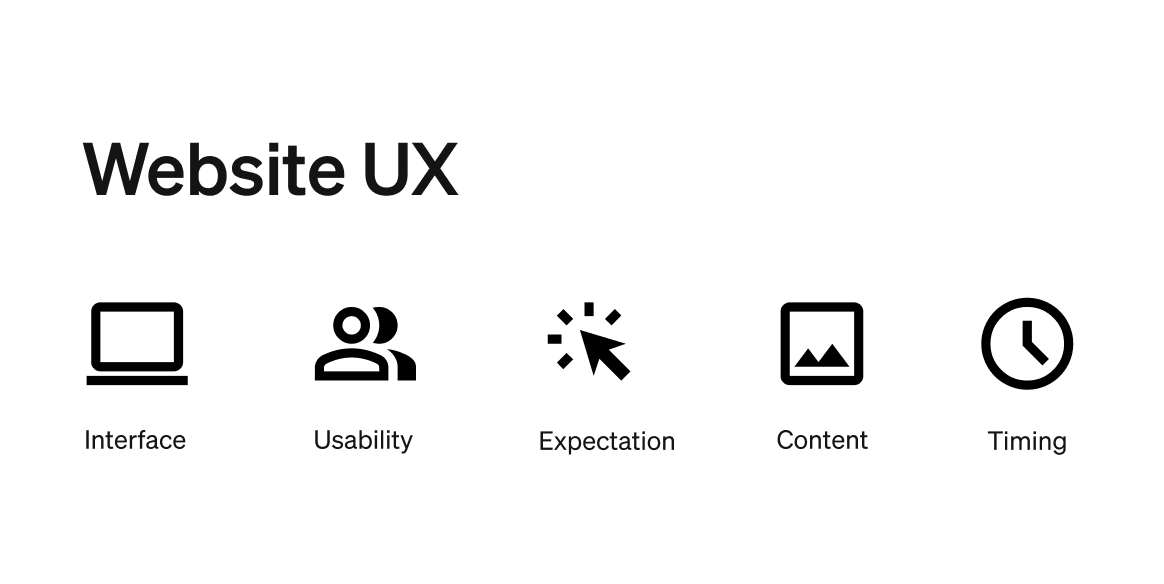
Having “good UX” on your website means considering these five things:
- Interface: does the interface follow good design principles?
- Usability: is the website easy to use and navigate?
- Expectation: does the website have and perform as you would expect?
- Content: does the content satisfy your needs and answer your questions?
- Timing: is it fast and load without lagging?

3. Map out the ideal member journey
In our Masterclass on managing and nurturing leads, we talked in length about the importance of knowing what action you want users to take when they get to your site.
You may have different actions you want someone to take spending on where they are in their journey, and different call-to-actions (CTAs) to match. Consider what action you want people to take (Book a Tour, Get a Free Day Pass) and create a website experience that gets them closer to taking this action.
User journey exercise
- Choose a common visitor intent, like: “I want to book a tour” or “I’m comparing coworking spaces”.
- Then open your site in a private browser window, and pretend you’re a first-time visitor with that goal.
- Click through your website like they would. What’s clear vs. confusing? What info is missing? How many clicks does it take to reach the goal?
- Capture your notes and ideas for improvement. Repeat with other common visitor goals.
4. Give users all of the information they need
Google reports that one of the best ways to get your website to rank well is by being the “last stop” in their search. It’s also one of the best ways to improve your conversion rate.
Someone should be able to get all of the information they need to make a decision from your website including your address, membership plans, pricing, and information about your community.
Present information clearly and consistently. Focus on providing information and value. Be the last stop in their process and search for a coworking space.
5. Make it easy to convert
It seems simple—if you want a high-converting website, you need to make it easy to convert. But you’d be surprised how many people ignore best practices when it comes to increasing website conversions.
Make your CTAs clear: Use clear and prominent calls to action (CTAs) throughout. This could include scheduling a tour of the space, booking a conference room, or signing up for a free trial pass. Use action-oriented language and design elements to make your CTAs stand out.
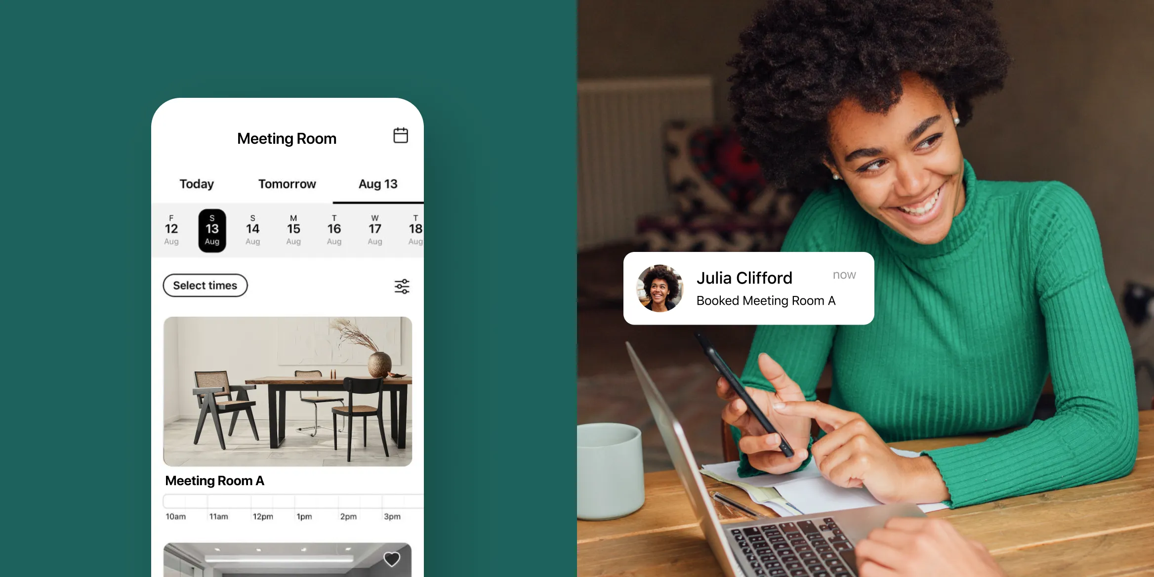
Create a user-friendly booking experience: Make sure your booking and payment systems are user-friendly and easy to navigate. Optix Web Widgets are online e-commerce booking systems that make it easy for users to book on your website.
Create automated follow-ups: Follow up with potential members automatically through email. You can build automated email sequences in Optix with Automations to make it easy to nurture leads throughout the entire funnel.
BONUS: Highlight social proof and invoke FOMO
Does social proof really matter? The short answer is, yes. 87% of people look at reviews of a product online before they decide to buy.
Social proof comes in many forms including:
- A quote from a happy member (or two)
- A case study or customer story
- An aggregate of your Google Business Profile rating
- Logos of companies who use your space
A little bit of social proof can go a long way in making people feel comfortable with engaging with your and your space.
Ready to make your coworking space website a converting machine? Connect with a member of the Optix team to learn how Optix can help your community thrive!
Frequently asked questions
Perform a user journey test by choosing common visitor intents like “book a tour” or “compare spaces,” then navigate your website in an incognito window to identify what’s clear, what’s confusing, missing information, and how many clicks it takes to reach their goal.
To rank well in search and convert visitors, your site should provide clear and consistent details on your location, membership plans, pricing, community benefits, and contact information—making the site the “last stop” on their search journey.
Use prominent, action-oriented CTAs (e.g., “Book a Tour,” “Sign Up”), implement user-friendly booking systems like Optix Web Widgets, and set up automated follow-ups for leads to streamline conversions.
Social proof—like member quotes, case studies, ratings, or brand logos—builds trust and reduces visitor hesitation, as 87% of consumers check reviews before making a purchase.


