We are passionate about creating experience-driven coworking software and strive to continually improve the impact and utility of our mobile technology. Our team has been hard at work designing a new look and feel for the apps to help you take your member experience to the next level!
Here are four things you and your members need to know about the improved mobile experience:
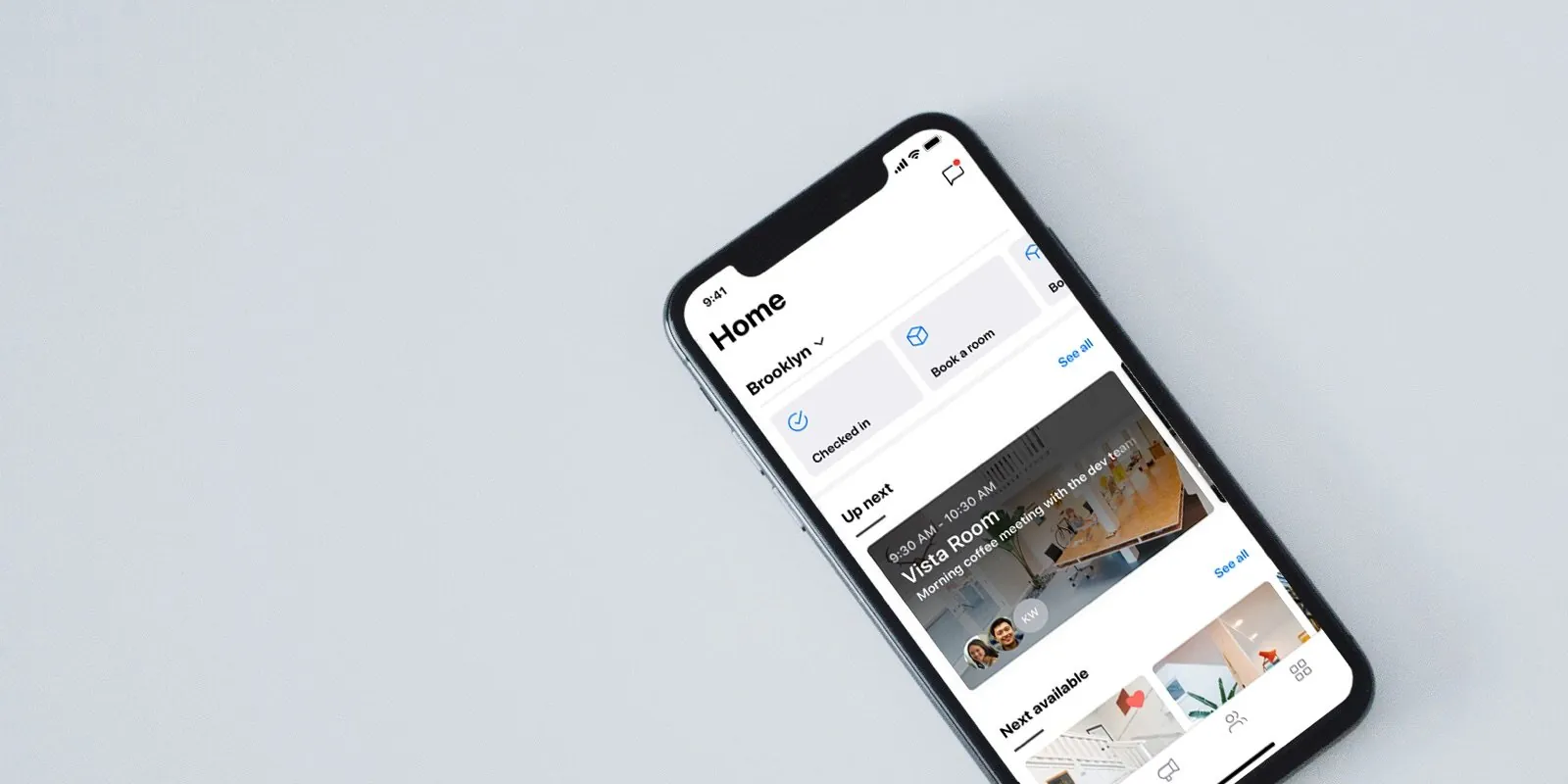
1. Your members now have a home screen
We’ve learned from the best – you! We’ve been analyzing what you’ve been pinning to your community feed and we’ve added some of these elements to your very own home screen. You’ll now be able to add a welcome message from you and your team of venue managers as well as add the venue’s Wi-Fi details for your members to connect with ease. Your members will also be able to directly book a room, check in, schedule a meeting, and book a desk, all from the new home screen. Lastly, the home screen will also showcase upcoming bookings and the next available rooms, making it even easier for your members to take the actions that matter to them most.
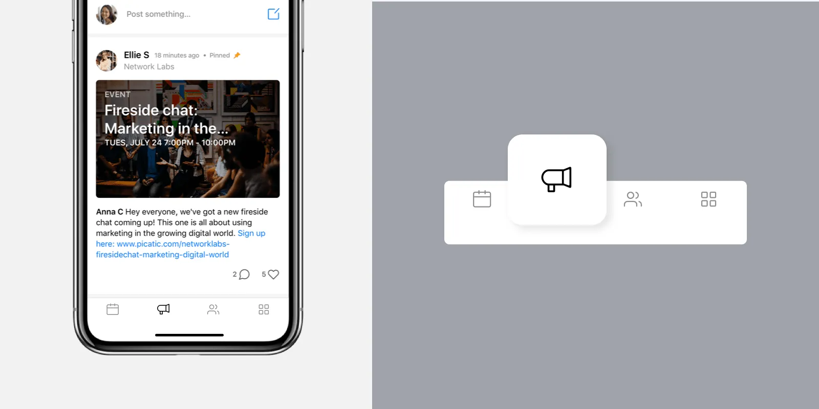
2. The community feed has moved and improved
The community feed now has its own tab! With the ‘must-haves’ moving to the home screen, the community feed now has its own space to shine. Your members will no longer see the ‘Getting Started Guide’ on their feed, instead they will see the latest and greatest posts from you and your community.
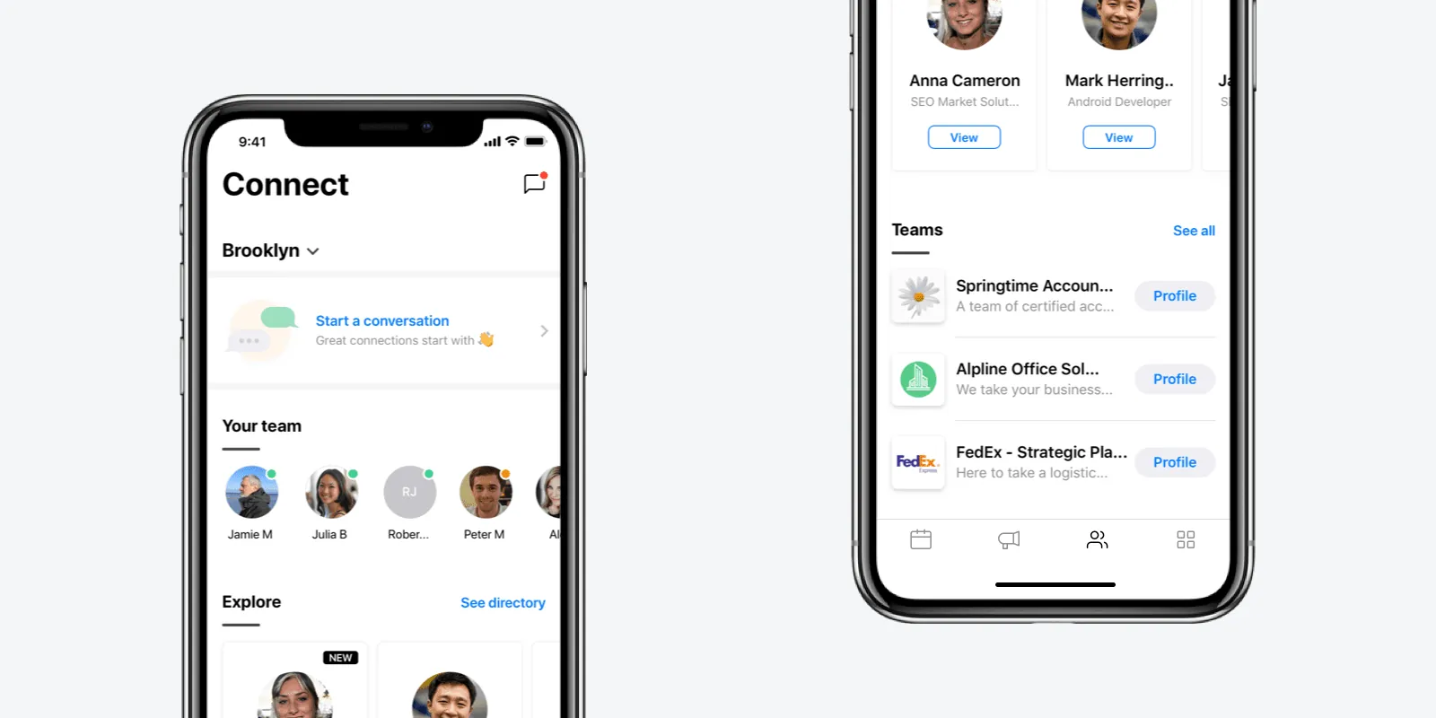
3. Improved ‘Connect’ functionality
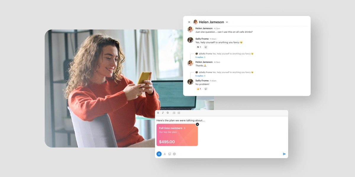
Connecting with your community has never been easier with the new connect functionality – and this is only the tip of the iceberg. Your members will now be able to see the most relevant members that they may need to talk to – such as their team and colleagues. They’ll also be able to see the various teams that work in the space and reach out to members that work for those companies. Lastly, the messaging functionality is no longer merged within the directory. Instead, it’s easily accessible from the Connect screen, or within the messages screen. This allows members to easily start a conversation with a quick tap!
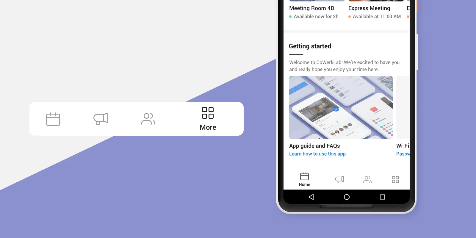
4. Completely new Android navigation
Good news for all of your Android members – their experience is changing for the better. With the new Android navigation, your members will be able to perform key actions seamlessly. We’ve designed a new navigation to be better suited for the actions that the app is designed for, with a bottom tab menu.
Not only have we redesigned the look and feel of the apps, we’ve redesigned the way the apps are built to create a much more scalable and customizable structure. We plan to bring more customizable features to you in the future – this is just the beginning! Stay tuned on our blog for future updates and announcements!

