As your coworking business scales, we want Optix to scale with you. We’re excited to be introducing design changes to the web platform to help scale our product and make your experience even more seamless when managing your community. These design changes will enable us to continue to build the best features for you now, and into the future.
Navigation on each page in the web platform has moved to a streamlined, left-side menu, content now takes the full page (including apps), and more! All of your favourite features and functions, but in a more organized way. So, without further ado, here’s 5 things to know about the new look and feel!
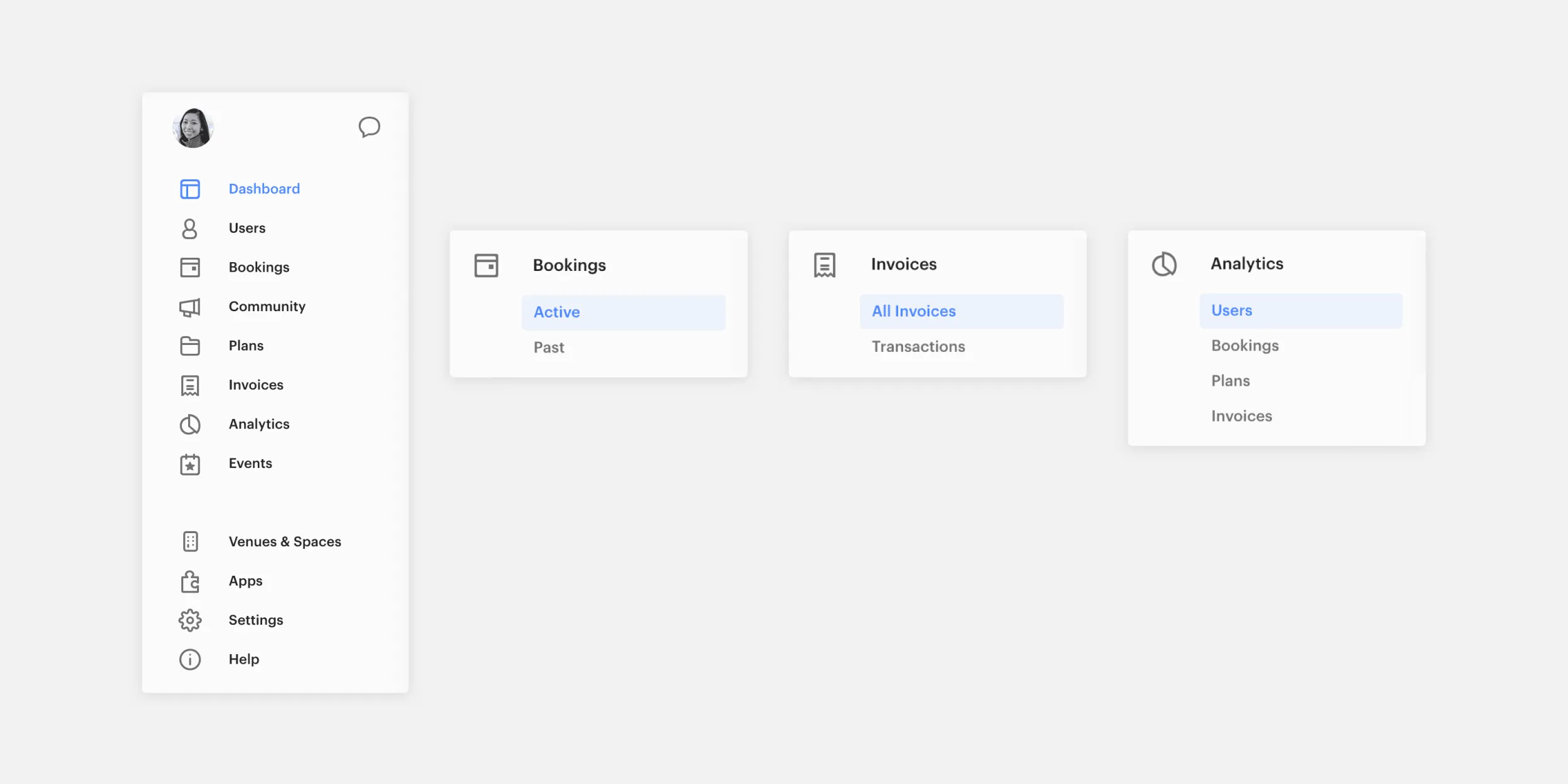
1. Navigation is now all within the left-side menu
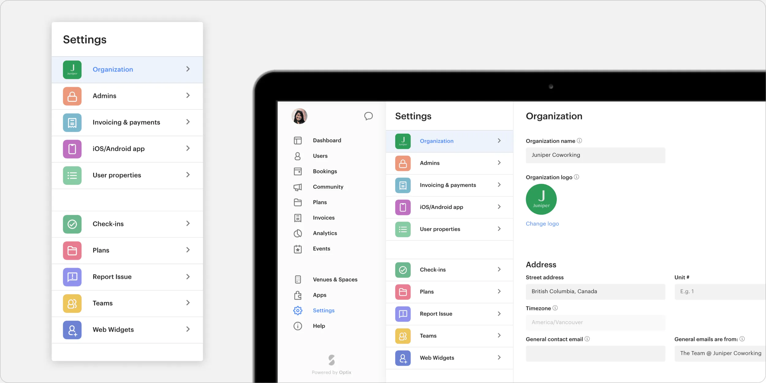
We’ve made it even easier for you to find what you’re looking for in your web platform with a more streamlined, left-side menu. Pages that were once navigated to at the top of the page via tabs, have all shifted into the left-side menu. Your account settings and messaging can now also be accessed from the left-side menu.
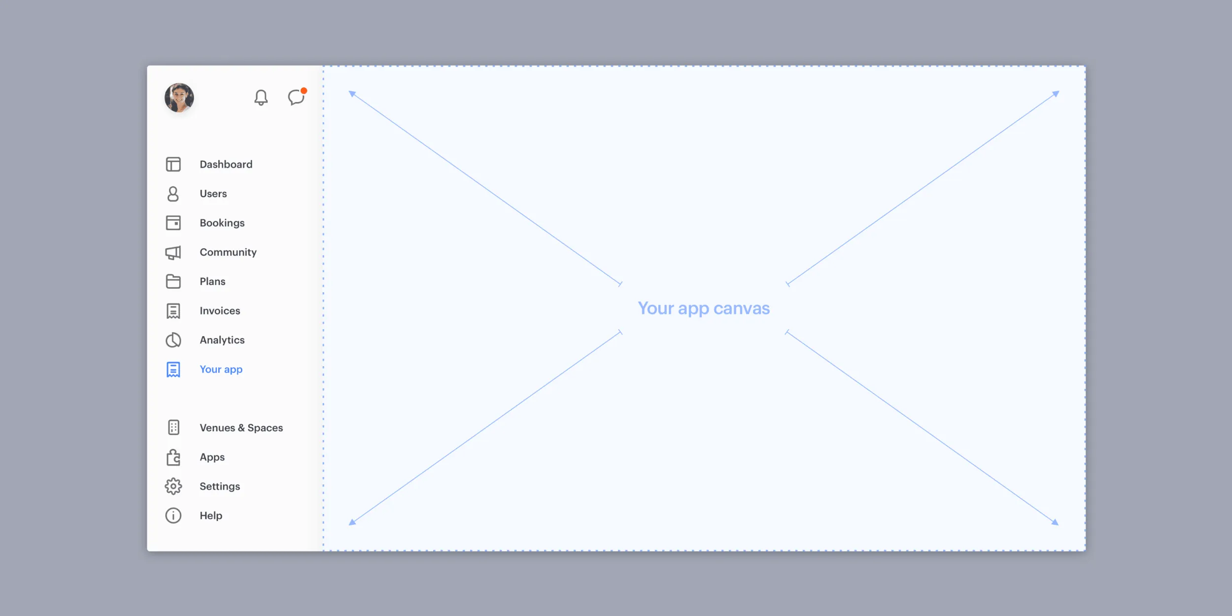
2. Full page content (including apps)
As our product scales, so do our features, and so does our content. So, we’ve given the content more room to shine with a full page layout that allows for horizontal scrolling. This is great news for your developers, as the canvas takes up the full screen too. We’ve also removed ‘manage apps’ to allow you to uninstall an app straight from the same app’s page.
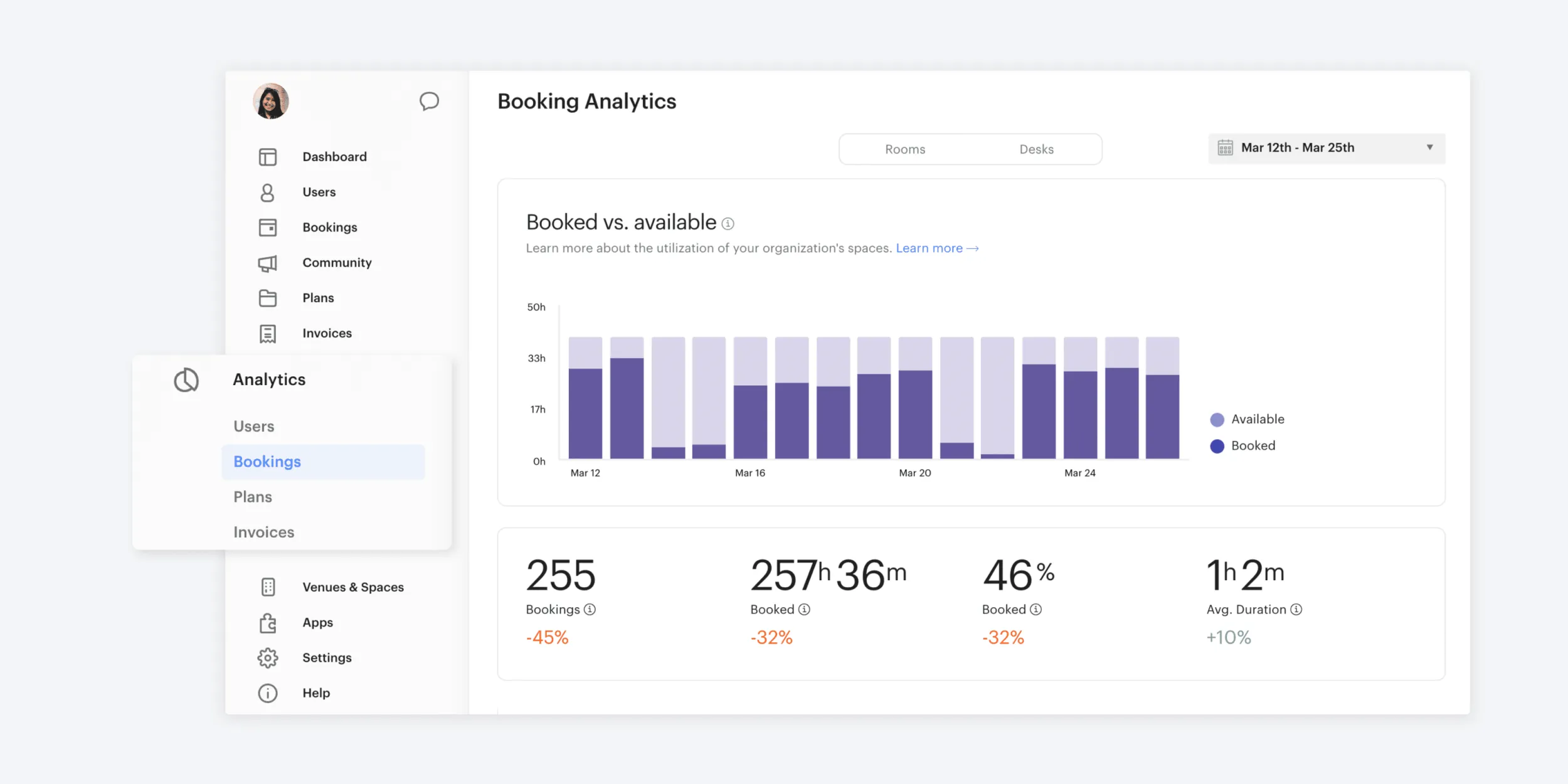
3. Analytics have moved to their own tab
Speaking of more room for your content, we’ve also moved all of your analytics reports from the individual page tabs to their own section in the left-side navigation. We wanted to provide you with one unified place for you to monitor how your coworking business is doing in order to gain valuable insights.
4. A more organized settings
We’ve overhauled your settings with a fresh look and more organized layout; including a new menu within your settings that includes all the fixings. New icons have been added for each individual setting so you can quickly navigate to what you’re looking for. Plus, app settings now load at the bottom of the main settings, to keep all of your settings together, in one place.
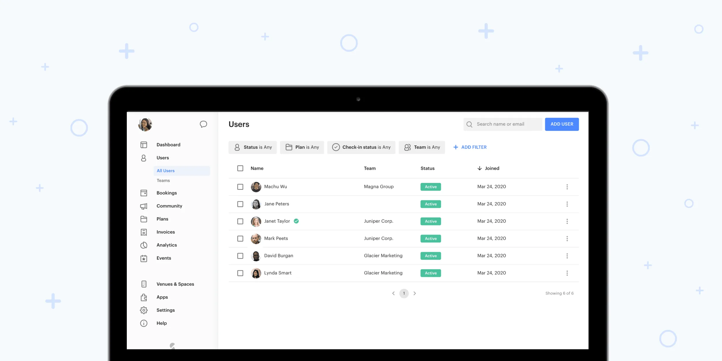
5. Updated visual style for filters
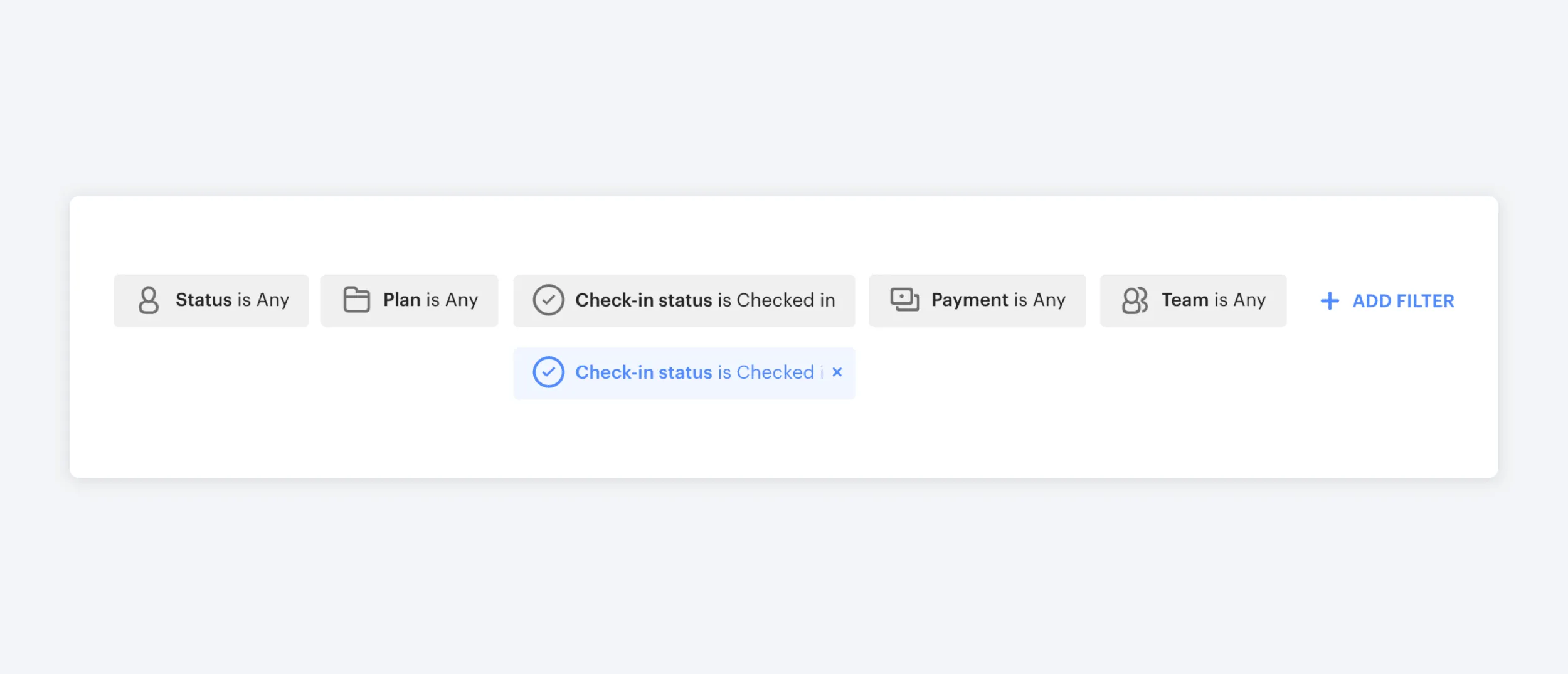
Your filters have an updated look-and-feel, providing more clarity and making it easier than ever before to track down the information you’ll need.
We’d like to thank all of our customers for helping shape the new look-and-feel for the Optix platform. We couldn’t have made these improvements without all of your feedback and suggestions. We’re continuing to make even more improvements to the web platform, so stay tuned for some exciting features coming soon!

